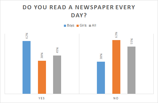
- 62 % of all boys read a newspaper daily.
- 63 % ot the asked girls read no newspaper.
- 38 % of the asked boys don't read a newspaper daily.
- 45 % read newspapers.
- Girls read fewer newspapers.
- In general, fewer girls read newspapers daily than boys.
- We do not know how many girls were asked.
- From the asked group of girls, fewer of them read the newspaper daily than the asked boys.
- Anna is the most common name in Austria.
- Hannah is the second favourite first name in Austria.
- Anna is the most common name used for girls born in Austria in the year 2014.
- 836 girls are named Anna.
- The most common name is Lukas.
- The most common name in Austria is Lukas.
- The most common name in Austria, given to newborn boys in the year 2014 is Lukas.
- The most common name in Austria, given to newborn boys is Lukas.
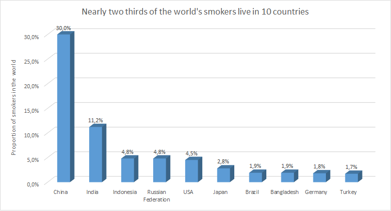
- 1.8 Mio. Germans smoke.
- 1.9 % of the world smokers live in Brazil.
- 2/3 of the world's population smoke.
- 2/3 of the world's smokers live in the depicted countries.
- Most smokers live in China.
- Every thirtieth person in China smokes.
- 30 % of Chinese people smoke.
- In India, 11,2 % are smokers.
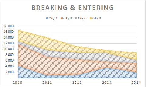
- There are 12.000 breaking and entering's in city D in 2012.
- There are fewer breaking and entering's in the year 2014 then 2010.
- The area diagram shows an increase in breaking and entering's.
- There are over 16.000 breaking and entering's in City D.
- An area diagram is best chosen to show a development over time while adding numbers of characteristics.
- To show a comparison over time, an area diagram is the best.
- The area diagram shows an increase of breaking & entering's in city C in the years 2012 to 2014.
- An area diagram was used to show the different cities and percentage of breaking & entering's.
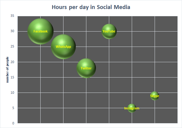
- All people use more facebook than youtube.
- Skype is only used sometimes.
- 18 people answered the question which social media they use with twitter.
- 5 people answered the question which social media they use with skype.
- The bar graph measures the number of students by their different ages.
- The bar graph shows a comparison of the number of students using different ages.
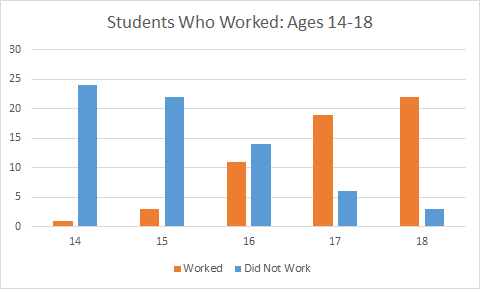
- The bar chart compares American students who worked and who did not between the age of 14 and 18.
- The bar chart compares students who worked and who did not between the age of 14 and 18.
